

Anomalous Patterns of Mortality and Morbidity in Pfizer’s Covid-19 Vaccine Trial


Summary
The Informed Consent Action Network (ICAN) has forced the FDA to release data from the Pfizer trial, this includes mortality, adverse event, and demographic data (health and age).
The data paints a picture of unequivocally non-random patterns in a data set that should be random except for the impact of the vaccine being studied.
Importantly, the data reveals a statistically significant connection between mortality rate and time since injection, for both the placebo arm and the mRNA arm. Very few deaths happen during the first 80 days, while unexpectedly many deaths occur around 100 days since injection, in a manner that could not arise by chance.
Cardiac SAEs in the trial also display highly unusual data patterns. Firstly, nearly half of all the cardiac events occur during the first 50 days since injection, whereas the risk exposure should be constant for the first 140 days. Secondly, there is a dramatic spike in cardiac events around 100 days from first injection in both the placebo and the vaccine arms – at the same time as the elevated rate of mortality.
Looking at the most common medical diagnoses prior to trial participation, yet another unexpected pattern emerges. All nine of the most common prior diagnoses are more prevalent in placebo arm participants.
Lastly, the age of the deceased participants differs significantly between the two arms.
The observed patterns cannot be the result of random occurrence. The only explanation compatible with all the non-random patterns is that the records of vaccine recipients suffering adverse events and death may have been changed, moving them to the placebo arm after the event.
Background
Ever since the novel vaccine products were released under Emergency Use Authorization (EUA), Pfizer and all the world's news organisations (brought to you by Pfizer™) have been kind enough to inform us that the products are both safe and effective. Or rather, they have inundated us with "trust the science" messaging, while hoarding the information on which that trust should be based.
However, since Pfizer did not share it on their own initiative, the Informed Consent Action Network (ICAN) petitioned the FDA to release the data upon which they based their EUA of Pfizer’s vaccine. Thankfully, ICAN took the FDA to court when they wanted to stall for 70 years, shortening the timeline to a year or so. A few weeks back in September 2023 they shared the most recent fruits of their courtroom endeavours.
This batch contains a several hundred pages long document describing all "Narrative Events" in the trials. The most dramatic of these events are of course deaths, but included are also "Other Serious Adverse Events” (read: move along, nothing to see here). In order to take a closer look at possibly suspicious patterns in the data, we parsed the text in the document into tabulated data. We also used the previously released full randomization scheme, which has been made available by the nonprofit Public Health and Medical Professionals for Transparency (PHMPT) as described here.
The data paints a picture of decidedly non-random patterns in a data set that should be random except for the impact of the vaccine being studied.
Why we use RCTs
Pfizer et al. have been touting that their results are based on a Randomized (Placebo-) Controlled Trial (RCT) so let's examine the premises for such a trial before diving into the data. The key words are Randomized and Controlled. The whole purpose of an RCT is to have one parameter that is under the control of the study (that would be the content of the syringes) and, since one cannot hope to control every other variable, to get a sufficiently large sample representative of the treatment target population and randomize the people from that sample into the two trial arms - the treatment arm and the control (placebo) arm.
If such randomization has succeeded, there should be no discernible difference between the two trial arms. Why? Because a successful randomization would have eliminated such differences. In other words, if the randomization is properly done, any systematic differences between the two arms can only be due to the controlled variable – the vaccine.
One could of course hypothesize that the vaccine is not the cause of such possible differences, but that would necessitate another explanation for any systematic differences. Failed randomization could be one such explanation – i.e., the patients weren’t randomly assigned after all – but that would raise the question of how such non-random assignment could happen and how the assigners might know things they shouldn’t.
Another theoretically possible explanation – if one really wants to stretch the imagination and engage in conspiratorial ideation – would be fraudulent or systematic data manipulation. But let us leave speculations aside for a moment and have a closer look at what the data says about differences between the two arms.
Overall Deaths
Let's start with one of the most scrutinized differences between the arms, namely total number of deaths. In the initial follow-up period, 15 deaths were reported in the vaccine arm, and 14 in the placebo arm. In a sample of approx. 22 000 people in each arm, 1 death does not constitute a difference. On the other hand, the subsequently reported 21 total deaths in the vaccine arm and 17 deaths in the placebo arm may sound more dramatic, especially since 2 of the 21 in the vaccine arm were previously in the placebo arm who subsequently received the vaccine when the trial was unblinded after the EUA.
However, given the zealousness with which people in the placebo arm were vaccinated after the EUA, we have to keep in mind the differences in risk exposure. Under the null hypothesis, there is no difference in all-cause death rate between the two arms. That means the number of deaths per person-time should be statistically equal between the arms (since we already know that there was hardly any impact on COVID-mortality in the trial – 1 vaccine COVID death vs 2 placebo COVID deaths).
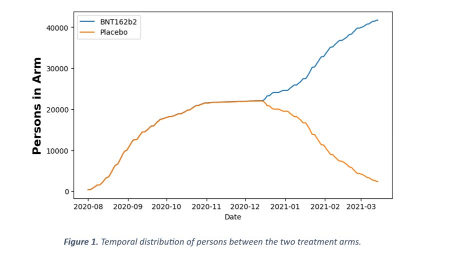
Figure 1 shows the number of persons in each arm as a function of time. It should be immediately clear that the amount of person-time spent in the vaccine arm is vastly greater than in the placebo arm. In numbers, between 1 Aug 2020 and 15 Mar 2021, there were 5.05M person-days in the vaccine arm and 3.26M person-days in the placebo arm, which gives a ratio of 1.55. In comparison, the ratio of 21 vaccine arm deaths to 17 placebo arm deaths is only 1.24. So, if anything, there is a deficit of deaths in the vaccine arm, not an excess, but this difference is not statistically significant (p = 0.24, comparing two Poisson rates). This means that, with respect to overall death counts, there is no support for the claim that more people died in the vaccine arm. But since the data in the documents is much more detailed, let's go one step further and instead of looking at overall numbers, let's look at the temporal distribution of these deaths.
Detecting Anomalies in Statistical Distributions
In order to consider whether the temporal distribution of deaths is expected (or surprising) or not, we need a way to evaluate the statistical significance of any deviation.
The Kolmogorov-Smirnoff (KS) test is typically used for such purposes, but it has the weakness of not being very sensitive at low sample sizes. There are only around 20 deaths in each arm of the trial, rendering the KS-test very insensitive.
There are other ways to do this, however, one of which is by applying the binomial test on sections of the distribution under scrutiny. For example, for a uniform distribution the probability of an event to occur in the first 30% of the distribution interval is 30%. If we then have 10 events in total and no events in the first 30% of the distribution, we can evaluate that probability by a binomial test with k = 0, n = 10 and p = 0.3. The p-value for the two-sided test in this example is 0.04, i.e., only in 4% of cases will such a pattern occur by chance alone.
Care must be taken, however, to avoid the problem of False Discovery Rate when performing many hypothesis tests, as we do here. To adjust for this, we use the Bonferroni-correction, which is conservative but universal. If we are evaluating 10 different sections, then a value of p = 0.005 (0.05/10) would be required for an α = 0.05 significance level. This is subsequently denoted as Bonferroni α = X, where X is the significance level after applying Bonferroni correction.
The Temporal Death Patterns
In the general population, the risk of death can be considered constant over a period of 6 months. Thus, in a study trial, the observed number of deaths should be unrelated to the study intervention and should be proportional to the number of people in the trial. As seen in Figure 1, the number of people in the trial arms is not constant over time. In the beginning, they were still recruiting people and later on, as participants in the placebo arm were vaccinated, that arm diminished in size.
So, let's consider the null hypothesis that the mortality patterns in the trial do not differ from the patterns in the general population. We know that 38 deaths occurred in the trial between 1 Aug 2020 and 15 Mar 2021, and we know that, under the null hypothesis, the probability distribution of deaths should be proportional to the person-days curve. For each day from 1 August 2020, we can look at the cumulative probability of death occurring up until that point. For example, 41% of all person-days spent in the placebo arm are spent during the 100-day period between 1 August and 9 November. That means that, on average, 41% of any deaths among placebo participants should occur in this period.
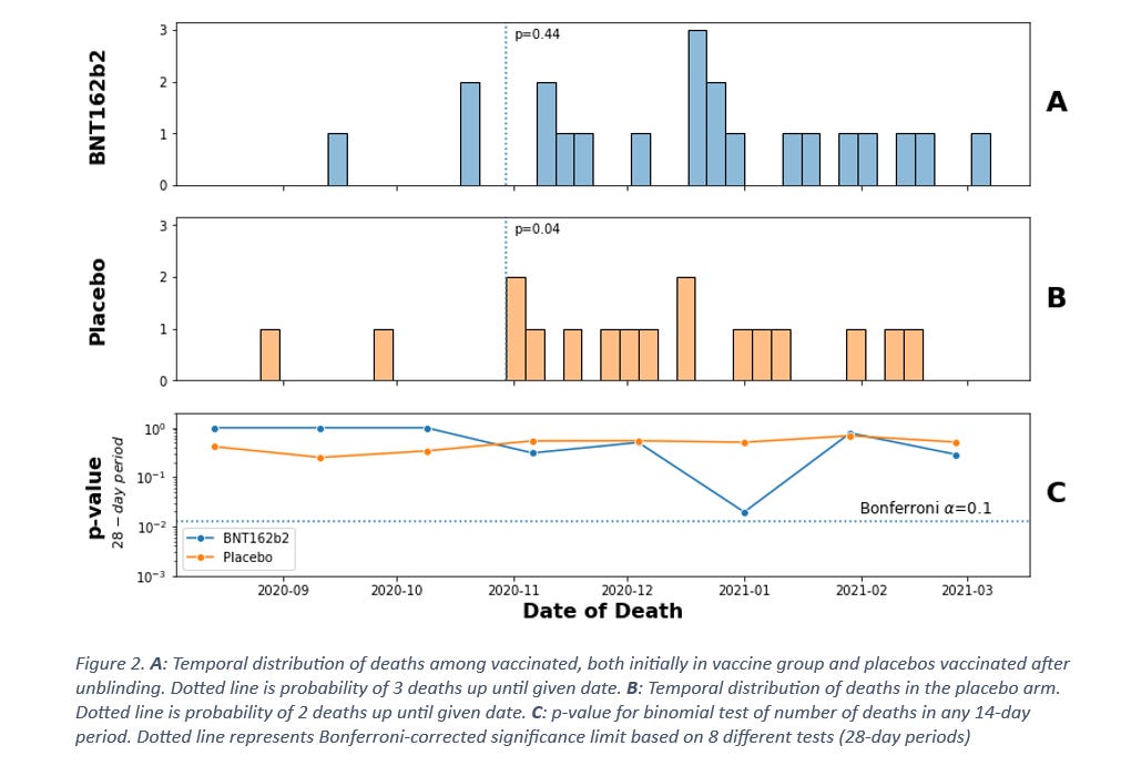
Curiously, very few deaths occurred in this period. So, few, actually, that around 1 November, the probability is only p = 0.04 (dotted vertical line chart B, Figure 2) that only 2 of the total 17 deaths in the placebo arm would occur in this time period, assuming that death rates are constant. Even though this is improbable, it might not alone be enough to raise questions. But if there are “too few” deaths in some periods, then there should be “too many” in other time periods. Looking at charts A and B in Figure 2, there appears to be multiple deaths around late December 2020, 6 of which occur in the vaccine arm. The probability of 6 out of the 21 deaths in the vaccine arm occurring within a matter of days from each other can be evaluated similarly to the previous method, by looking at the probability of occurrence for a moving period. We will use 28 days – four weeks – as the period, making for a total of 8 periods between 1 August 2020 and 15 March 2021. Chart C in Figure 2 shows that the pattern around December for the vaccine arm is slightly above the threshold of statistical significance with our conservative approach – the probability of 6 deaths occurring during 28 days by chance alone is p = 0.1 after Bonferroni-correction for 8 hypotheses.
Based on this analysis, there appears to be anomalies in the temporal distribution of deaths, but the significance isn’t very strong. Keeping in mind that the Bonferroni correction is a conservative one, further investigation may lead to stronger signals. Ostensibly, if there is a connection between mortality patterns and the study intervention, then one should expect the time from intervention to be the more relevant parameter. Since not all participants were recruited at the same time, this is not the same as calendar dates, so let’s have a look at the distribution of deaths as a function of time from injection.
Time since Injection
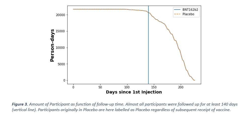
Trial participants were recruited at different times but the cut-off date for follow-up is the same for all, therefore not all participants will have experienced the same follow-up time. To account for this, we need to look at how many participants had been in the study for how many days at the cut-off date. For simplicity, let’s discount the fact that placebo arm participants were vaccinated, and consider them as placebo participants up until cut-off 15 March 2021. If there were truly no negative effects from the vaccine on mortality, then vaccination should have no mortality impact on the placebo arm. As can be seen in Figure 3, almost all participants had been part of the study for at least 140 days at the cut-off date 15 March 2021. With the null hypothesis assumption of the background death rate being constant, there should be no temporal difference in probability of deaths occurring during the first 140 days, since nearly all participants (95%) have been in the study for 140 days at by that date.
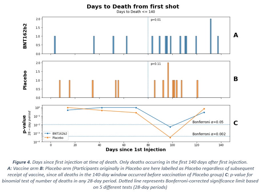
Perhaps unsurprisingly given the previous observations, this is not what we see. Instead, the same pattern of fewer deaths during the first three months after injection is visible (Figure 4). At 80 days since first injection (placebo or mRNA), there is a deficit of deaths compared to what would be expected based on the total number of deaths in the period, with test statistics p = 0.01 for the vaccine arm and p = 0.11 for the placebo arm, based on binomial testing (see dotted lines in Figure 4 chart A and B).
Similarly, for the 28-day period in chart C, both arms show clearly significant deviation from expected rates, with far too many of the total deaths occurring in the period around 100 days after injection (p < 0.05 for vaccine and p < 0.002 for placebo after Bonferroni correction).
At this point we have established beyond any doubt that the mortality rate is constant neither in calendar time nor in time since injection. Some might interject that mortality patterns vary by season, but if this were the explanation here, the connection should be weaker in the time since injection-dimension than in calendar time. Instead, the opposite is the case. Furthermore, seasonal mortality variability is only prevalent among the elderly, whereas the deaths in the trial are mainly among the people younger than 70 years as we shall see later.
This means that there is a connection between mortality rate and temporal vicinity to injection, for both the placebo arm and the mRNA arm. What could explain this? It could be that people displaying signs of frailty were excluded from the trial during recruitment, thus introducing a kind of healthy user bias which would gradually fade with time, pushing forward deaths to later in the trial. The increase in mortality at around 100 days is not compatible with this explanation, however.
What other explanation might there be? This peak might be more consistent with negative effects from the vaccine causing deaths with a delayed effect. In that case, the initial death rate during the first 80 days might represent the background death rate, whereas the rate between 80 and 110 days since injection might be caused by the vaccine. But why is there also an increase in deaths in the placebo arm? For this explanation to be make sense, it would require the effect of the vaccine to also impact the placebo arm.
We consider that this might occur in two possible ways - either by the mRNA being given also to participants in the placebo arm or by moving the deceased participants from the vaccine arm into the placebo arm.
One could also imagine a third possibility, that record exclusion or deletion, as described here, may have created this non-random pattern. However, this explanation cannot account for why adverse events in the placebo arm are associated with time since injection. Thus, it could only partially explain the observations.
Other SAEs (Serious Adverse Events)
If there were negative effects from the vaccine during the trial, then one might reasonably expect there to also be non-lethal adverse events in greater abundance than the lethal ones. Cardiac events such as myocarditis have even been accepted as linked to the vaccine (albeit after many months of denial), so one might also reasonably expect there to be such events in the trial if there were real concerns about the vaccine causing elevated mortality.
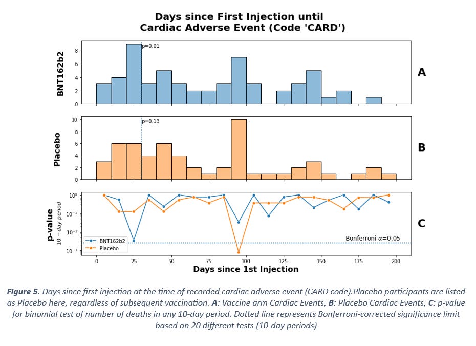
The recent documents list Other SAEs in addition to the fatal ones, accompanied by diagnostic code abbreviations. For cardiac-related events the code CARD is used.
Figure 5 shows the temporal distribution of such events, measured in time since first injection. The data patterns are highly unusual. Firstly, nearly half of all the cardiac events occur during the first 50 days, whereas the risk exposure should be constant for the first 140 days (Figure 3). Secondly, there is a period of time around 90-100 days after first injection with clearly elevated rates of cardiac events. We therefore see an elevated rate of cardiac events during the same period of time since injection when we saw an elevated rate of mortality.
The accumulation of events in the first days after injection is significant among the vaccine arm and the peak around 100 days is significant in the placebo arm (Figure 5 chart C). The period here is 10 days as opposed to the previously used 28-day period, since the peak at 100 days is very concentrated. One might observe that changing the period like this introduces a new risk of false discovery, but in this case the number of observations is greater and thus even the KS-test shows clear deviation from the expected distribution, at p = 0.02 and p = 0.002 for the vaccine arm and placebo arms respectively. In other words, there can be no doubt that the cardiac events do not occur at a constant background rate.
Other Discrepancies – Medical History and Age
In the records of the people suffering adverse events is also listed their medical history. If the trials were free of errors, mistakes or manipulation of the randomization criteria and all participants remained in their originally assigned arms until unblinding, then there should be no discernible differences in medical history prior to the trial. If, on the other hand, participants were selected to one arm based on prior health or if they were moved from vaccine arm to placebo arm at some point, then one would expect to see anomalies in the distribution of prior health status.
Looking at the 10 most common medical diagnoses prior to trial participation, yet another unexpected pattern emerges (Figure 6). 9 out of 9 of the most common prior diagnoses are more prevalent in placebo arm participants.
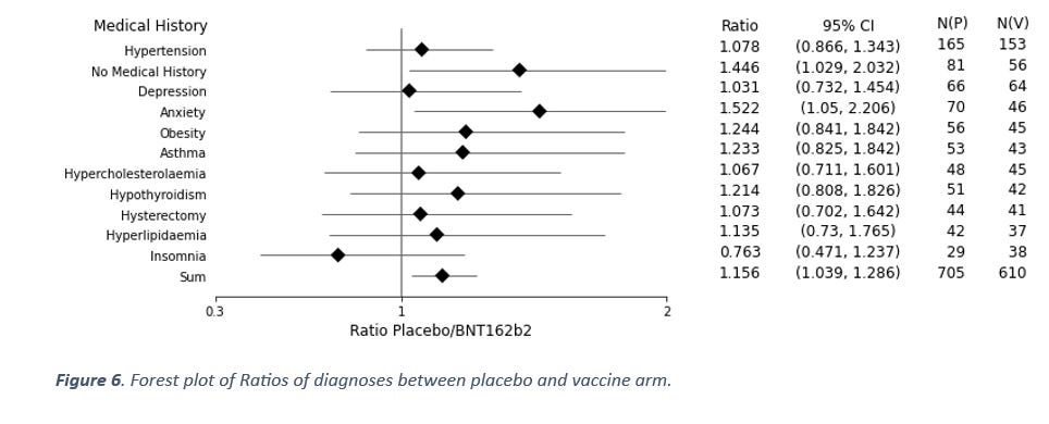
This data represents an ordered sequence (ordered by frequency), and since these are ordered, the probability of this occurring by chance alone is the same as getting eight heads in a row when flipping a coin (allowing for the first throw to be either one). The chance of this is p = 0.004. Furthermore, two of these diagnoses even show a ratio that is statistically significantly greater than one on their own account.
Again, why would the data look like this? If the healthy people were selected to the vaccine arm, then why are 81 of the cases in the placebo arm people with “No Medical History” while only 56 cases in the vaccine arm are people with no medical history? Surely it should be the other way around if the healthy people were selected to the vaccine arm? And if the placebo was not inert at all, then we would expect similar rates between the two arms, not elevated solely in the placebo arm.
If, on the other hand, there were certain prior diagnoses that predisposed the participants to adverse events from the vaccine and if such cases in the vaccine arm were relabelled as placebo participants, then one would expect these diagnoses to be overrepresented in the placebo arm.
Lastly, let us review the age distribution among the deceased participants. As with every other data dimension, there should be no differences in age between arms if randomization was successful and nothing unusual occurred in the trials. And as with all the other metrics considered, this is also not the case with age of the participants who died.
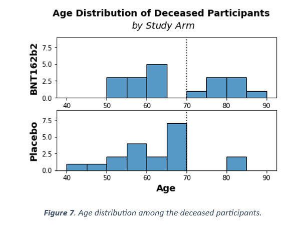
There are at least two unlikely patterns in Figure 7. The first is that only two people above 70 years of age died in the placebo arm, as opposed to eight in the vaccine arm. The distribution should be random and equally probable, so according to the binomial distribution, the probability of such a pattern to arise from chance alone is p = 0.1 – not alone significant, but unlikely. The second unlikely pattern is that 7 people between the age of 65 and 70 died in the placebo arm and none died in the vaccine arm. This is even more unlikely, at p = 0.016.
Even the mean age of the deceased is significantly different between the arms (t-test p = 0.032). So, we have also detected an anomaly in the age distribution of the deceased. Why would we observe that? If one was moving participants from one arm to the other based on adverse events, and one was not being very careful in overseeing this process at the study population level, it is likely that some metrics would become skewed as a result. The difference in diagnoses is one such skewed metric, the difference in age distribution among the deaths is another.
Conclusions
Before concluding, we would like to remind readers of the multiple accounts of unacceptable clinical trial practices that have been levelled against Pfizer and their subcontractors. Among these accusations, with photographic evidence provided, is that information that would immediately unblind anyone casually encountering it lying around at the clinical trial sites.
In the interests of balance, it could be argued that higher mortality or SAEs in the placebo arm might have been caused by Covid-19. We doubt that this is the case based on our hypothesis, described here, that it is bacterial pneumonia that is the direct cause of respiratory deaths, and that SARS-CoV-2 might be best understood as a bystander infection. Likewise, we believe that the trial is too underpowered to statistically detect a mortality signal for SARS-CoV-2 given the relatively low infection fatality rate for the virus, especially in the participating cohort in this trial. Lastly, while covid infection could possibly explain differences between the arms, it cannot explain the temporal association between SAEs and injection in both the placebo and vaccine arms.
We are asked to “trust the science”, while the information the science is based on is withheld until the public forces the government’s hand. Now that the information is coming to light, the foundations of The Science™ are crumbling. Any serious and sincere agent on the scientific scene would answer the questions that the above data pose and explain why there is no reason for concern.
We have established that there is a connection between mortality rate and temporal vicinity to injection, for both the placebo arm and the mRNA arm. We have also established that there are elevated Cardiac Adverse Events at the same time as elevated mortality rates. Furthermore, we have seen that prior health status is different between the two arms, and that age distribution among the deceased participants are significantly different between the placebo and the vaccine arm.
We see no innocuous way by which the described patterns could occur. Instead, these data may be evidence of at best tinkering with the randomization scheme or at worst data may have been manipulated to achieve FDA-approval of a harmful product.
 | A guest post by
|
Anyone know what the placebo was? Pharma have a habit of using another vaccine as a placebo and not an inert substance because it obscures safety signals.
Wow, that is quite the allegation.
Thank you!