


The latest ONS data on deaths by covid vaccination status
After 7 month delay - the same (and worse) systemic problems and multiple flaws


27 July 2023 Important Update video:
Summary
None of the core limitations and flaws of the previous report have been resolved.
The ONS appear to have ignored the UK statistics regulator who required them ‘to address some of the sampling issues present in the first six iterations of the publication’.
The higher non-covid mortality rates in the unvaccinated confirm there are biases/confounders still not adjusted for.
There is still gross underestimation of the proportion of unvaccinated in the population. This artificially inflates mortality rates of unvaccinated and reduces rates of vaccinated.
Use of new census data means the data in previous reports has changed significantly but seems no more reliable.
The data for months Jan-March 2021 have been removed. These were the months that especially exposed misclassification of deaths shortly after vaccination.
There are numerous errors in the data and key data are missing or difficult to analyse.
Even if we were to trust their data, the evidence actually points to safety risks especially in the younger age groups.
Ultimately, we don’t think we can trust any public health statistics produced by the ONS. Given this the regulator has failed to maintain the public’s trust in the ONS or government policies based on the data.
A missed opportunity
We have reported extensively on the problems with the ONS reports on deaths by vaccination status. We complained to the Statistics Regulator about the July 2022 reports, and he agreed with our recommendation to ignore any claims of vaccine safety or efficacy based on the data and also that the ONS underestimates the true population proportion unvaccinated.

After a 7-month delay since the previous update on 21 Feb 2023 the ONS finally released a new version with data up to Dec 2022. The previous version (released July 2022) had data up to May 2022. So, there was great anticipation that the ONS would in the time available resolve the issues with their dataset and settle open questions about vaccine efficacy and safety. Unfortunately, this opportunity was missed.
To show how seriously they took their task, despite all that time they had to get it right, a corrected version was issued 24 hours later after many people pointed out errors (more of that below - in fact they only fixed some errors on month labels).

Inevitably, as in the previous report, the ‘headline’ figures are that the all-cause mortality rate - measured here by the age-standardised mortality rate (ASMR) - has been consistently lower among the vaccinated than the unvaccinated (although the difference is narrowing). If the data were accurate and reliable then, as we have always argued, the all-cause mortality rate is, indeed, the most objective measure of vaccine safety and efficacy. But, as in the previous version, it is easily shown that there are systemic flaws and biases in this latest version which make the stated ASMR figures meaningless.
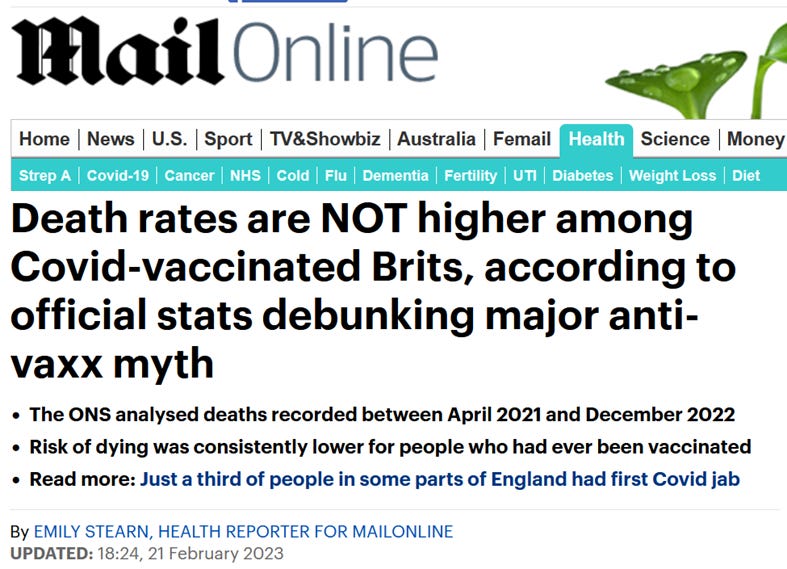
Of course, this did not stop inevitable mainstream media publishing of predictable pre-prepared stories ridiculing ‘anti-vaxx myths’ claiming the data proved that death rates were lower among the vaccinated:
A very quick look through the data reveals some obvious concerning changes from the previous version, namely:
Data for those under 18 have been removed.
Data for Jan-March 2021 has vanished.
There are many changes to the raw data for April 2021-May 2022 between latest version and previous versions.
What the ‘sceptical’ papers say
There has been an enormous volume of discussion and analysis already about the data. We have not done any detailed analysis of it yet - for reasons partly explained here:
However, here we provide a round-up of the analyses already done by other sceptical writers and offer our brief comments on some of these analyses.
ASMRs
First, before going through these, it is important to note that (for reasons explained here) the age standardised mortality rate (ASMR) is a terrible metric for assessing vaccination safety (also it cannot be reproduced by the data provided1). While it accounts for age-confounding, it obscures the information needed to determine risk/benefit for different specific age groups.
By looking at raw mortality rates within each age category there is no need for the complex, obfuscated ASMR. The ONS do provide age categorised breakdown:
18-39, 40-49, 50-59, 60-69, 70-79, 80-89, 90+
(Although the 18-39 category is rather ‘coarse’ and, unlike previous versions, those aged under 18 are no longer included so we have less information than before).
Tore Aarhus Gulbrandsen has produced the relevant all-cause mortality graphs for each of the age groups (note the ONS uses person years rather than number of people2)

Note that, as in previous ONS releases, there are wild fluctuations in mortality rates for the different categories of vaccinated. But in no age group is there any strong evidence of reduced all-cause mortality for the vaccinated.
A colleague (who wishes to remain anonymous) has produced this chart summarising these (and the changes from the previous version):

Why would the ASMRs change so dramatically for the unvaccinated change between releases?
The ONS summary data was trumpeted by the mainstream media and those continuing to push the ‘safe and effective’ vaccine narrative, since it shows the ASMR for the unvaccinated higher than that of the ever vaccinated. But a deeper look into the data reveals the key problems with this.
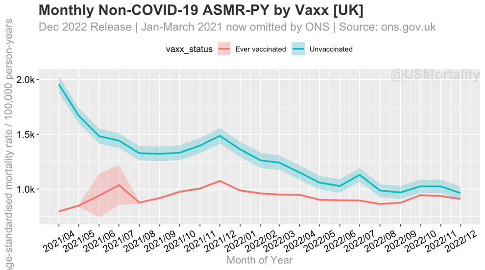
Note that the Jan-March 2021 data have been removed (the ONS says this is because they are using the new 2021 census which only includes people alive after March 2021), so it is important to remind people of the following key graph of non-covid mortality from the previous report’s data:

Since this is non-covid mortality the plots for unvaccinated and vaccinated should be similar. As we explained in detail, the sharp peak in unvaccinated non-covid mortality in Jan-March 2021 (which was when the vaccine was rolled out) must have been the result of misclassifying those dying shortly after vaccination as unvaccinated. But the fact that there was a continued (albeit decreasing) difference proves there was systemic bias/confounding of the data through one or more of:
misclassification of vaccinated deaths as unvaccinated
underestimating the population proportion of unvaccinated
‘healthy vaccinee effect’
This bias influenced all of the mortality rates, but the ONS did not adjust for it at the time. They were however keen to assume a healthy vaccinee bias but presented no evidence to support this lazy assumption.
Likewise, in our latest report we pointed out that the ASMRs reported for Feb-May 2022 were significantly lower than historical rates from 2016, for younger age groups (59 and below), giving rise to what we dubbed the ‘dead presumed missing’ phenomena. We suggested that this can be explained by deaths that are missing from their dataset. Comparing the ASMRs in the latest ONS release reveals this same problem, as shown in the table below. So, the mortality risk of people in the ONS dataset remains significantly different from the general population and we can see there are huge changes in the reported mortality rates between this ONS report and the last one, with percentage changes in mortality ranging from -31% to +38%. Why these dramatic changes?

How did mortality change in the latest release? Ben of USMortality provides the updated plot:
Clearly the systemic problems have NOT been fixed in latest version. They have got WORSE.
Denominators
What about the critical problem with underestimation of the proportion of unvaccinated? Unfortunately, again, this problem has not been resolved even with the new census data. Clare Craig and Igor Chudov have both analysed this. Here is the table Clare sent us with the ONS estimates of proportions of unvaccinated in each group.

As Igor Chodov pointed out as an example, the March 2022 ONS estimate for the 50-59 age group is that there were just 6.19% in this age group unvaccinated, but according to the UKHSA Week 13 vaccine surveillance report, (Page 17) 87% of the 50-59 age group were vaccinated in March 2022. So UKHSA say 13% were unvaccinated (a figure we know to be much more accurate).
Miscategorization
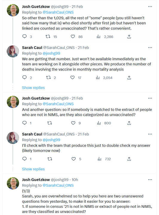
We also know that miscategorization is still happening. Indeed Note 17 of the ONS spreadsheet asserts:
There were some people who were vaccinated but not included in the NIMS data as they died soon after vaccination. Of these, 1,029 linked to our 2021 Census linked dataset. We included the latest vaccination records for these people in our dataset. This data is provisional and extends up to the 1 November 2022. This will be updated in future releases.
This led to an interesting twitter exchange between colleague Josh Guetzkow and the head of mortality at the ONS Sarah Caul MBE (Member of the British Empire) of the ONS:

Further issues with the ONS data
Further issues were raised by Clare Craig:


Ben from USMortality raised the following concerns:

Mortality charts
Ben also produced these useful charts of absolute death counts in each age group:
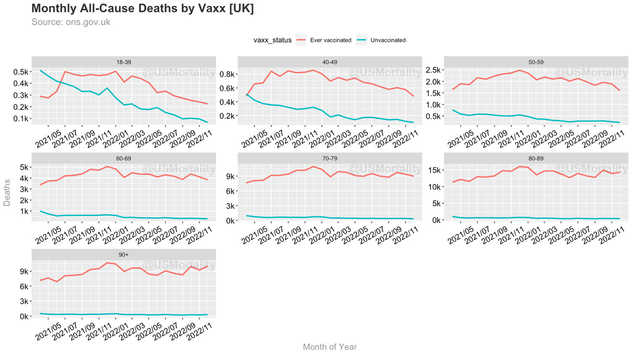
While obviously most people in the older age groups are vaccinated the following plots do not exactly support the much-repeated mantra that the vaccinations ‘stop people dying from covid’.


Joel Smalley has done an important analysis that shows we consistently see elevated mortality rates for the vaccinated since the start of 2022 when COVID represents less than 10% of deaths but the vaccinated disproportionally more of all deaths.

Here are his charts for the 18-39 age group for all-cause and non-covid deaths from the new ONS dataset (with percentage vaccinated from the UK Government Coronavirus Dashboard):


Clearly, there are disproportionately more deaths in the ever-vaccinated population than one might expect from the percentage of the population vaccinated and Joel’s analysis looks to be a powerful indictment of the vaccine’s safety profile, but it is itself based on data we know we cannot fully trust.
Why can’t we trust it? Because a cursory analysis of the death counts in the ONS dataset shows that the death counts from Table 5 and Table 2 differ, as discussed in this twitter thread. @ExcessBurden has produced this chart showing the differences in death counts!!

Clare Craig asked the ONS about this discrepancy in death counts and explains how deaths can occur amongst the population “ghosted” by the ONS.
el gato malo reaches the same conclusion as us about the data and highlights further concerns:

The ONS data seem to suggest the vaccine provides mortality benefits whether or not you take it ……..
Final remarks
To date we have produced three exhaustive analyses of the ONS data, each of which has consumed a massive amount of time and effort. Recall that this data was said to be the gold standard produced by the best, most reliable official statistics department in the world.
Each time we looked at their data we, and many others, have discovered a litany of biases, errors, oddities, missing data, inconsistencies, contradictions and under/overestimates. The ONS have either ignored our analyses or made lazy off hand assumptions that they believe explains these issues. None of the issues we have identified have been addressed and none of their assumptions justified.
We had, perhaps naïvely, hoped that the ONS would have responded to the criticism from the UK statistics regulator and ‘upped their game’, but clearly, they have treated us, and the regulator, with contempt. Far from resolving all of the issues this report was replete with the same errors, was obviously hastily put together and even had to be fixed and updated within hours of release. More importantly all of the original issues and biases remain unaddressed. These events raise many legitimate questions:
If the regulator doesn’t require the ONS to produce accurate or useful information about vaccine safety and efficacy, what is the ONS for? What are we paying our taxes for?
If the regulator can be ignored, where the official statistics produced by the system are as bent before and after regulatory intervention, why do we need a regulator at all? Why are we paying for this?
Why should we accept anything the UK government has historically claimed about the covid vaccines based on this data? Why should we accept any of their public health claims in the future?
Finally, here is Norman Fenton’s interview with John Campbell and a pdf of the slides:
It is impossible to replicate the ASMR with the data the ONS provide. They use the ASMR formula explained here) but with 5-year age categories (i.e., with data they don't provide) and with ratios based on the 2013 'standard European population'.
They use number of person years instead of number of people because a person could spend parts of the year in more than one vaccination category. So, imagine a population of 1000 people. Suppose in January none are vaccinated and then in Feb 100 get vaccinated. Then in Jan there are 1000 people each spending 31 days unvaccinated. That is a total of 31,000 person days or 85 person years unvaccinated. Obviously, there are 0 person years vaccinated in Jan. In Feb there are 900 people spending 28 days unvaccinated and 100 people spending 28 days vaccinated. That is 69 person years unvaccinated, and 7.7 years vaccinated etc.
None of this is difficult. It's not a resourcing issue either. The regulator warned them but is clearly toothless. Everything is broken. Deliberately.
Yup. Back in the 70s there would be general strikes and marches demanding resignations and trials.......